Our cloth dinner napkins can be customized to suit your event and reflect your unique style. Here are some tips for designing unforgettable napkins:
Recommended Files and Formats
When you choose to personalize your cloth dinner napkins with printing or embroidery, it is essential to send files in high-quality formats:
| Format |
Advantages |
Limitations |
Recommended Uses |
Resolution/Technical Requirements |
| AI (Adobe Illustrator) |
- Scalable without losing quality.
- Ideal for vector graphics.
- Precise customization.
|
- Requires specialized software (Adobe Illustrator).
|
Logos, geometric patterns, monograms. |
Convert fonts to outlines. Use CMYK color mode. |
| EPS |
- Compatible with multiple programs.
- Retains sharp details at any size.
- Reliable for printing.
|
- Not suitable for complex designs with photos or gradients.
|
Detailed graphics, logos, icons. |
Set up in CMYK. Include bleed and safety margins. |
| PDF |
- Combines vector and raster elements.
- Easy to share and review.
- Supports multiple layers.
|
- May cause issues if fonts or color profiles aren’t embedded correctly.
|
Mixed designs (text and images). |
Minimum resolution of 300 DPI. Uses CMYK color profiles. |
| PNG |
- Transparent background.
- Good contrast for simple designs.
- Widely compatible.
|
- Not scalable without quality loss.
- Not ideal for complex large-scale designs.
|
Images with transparent backgrounds, and simple details. |
Minimum resolution of 300 DPI. Maintain original size. |
| JPEG |
- Efficient compression for smaller files.
- Compatible with all devices.
|
- Quality degrades with each edit.
- Does not support transparency.
|
Photos, images with solid colors. |
Minimum resolution of 300 DPI. Save at maximum quality. |
| TIFF |
- High resolution with no quality loss.
- Ideal for photos and complex designs.
|
- Large files that may be difficult to handle or send.
|
Photos, gradients, complex textures. |
Minimum resolution of 300 DPI. Set in CMYK. |
Additional Tips for Preparing Your Design for Cloth Dinner Napkins
Creating a polished and professional design to stamp on your cloth dinner napkin requires attention to detail and an understanding of how your artwork interacts with the fabric. Here are some expanded tips to help you prepare your design for the best results.
Spacing and Margins
Proper spacing and margins ensure that your design remains intact and visually appealing throughout the production process:
- Safe Zone: Leave at least 0.5 inches (1.27 cm) of margin between the edge of the napkin and your design. This prevents key elements from being cropped during production or folding.
- Avoid Crowding the Edges: Keep intricate details and essential components, such as logos or text, well away from the edges to ensure the design stays centered and intact after production.
- Alignment Tips: Consider how the napkin will be folded and displayed. Position the design to align naturally with folds or corners for maximum visibility.
Colors and Contrasts
Choosing the right colors is crucial for ensuring your design stands out and maintains its integrity during printing or embroidery:
- Use CMYK Colors: Always prepare your design in the CMYK color model (Cyan, Magenta, Yellow, Black), as it is specifically designed for printing. Avoid using RGB (Red, Green, Blue) as it may lead to unexpected color discrepancies during production.
- Test Contrast: Ensure your design colors contrast effectively against the napkin's base color. For example:
- A white design will stand out beautifully on dark fabrics like navy blue or black.
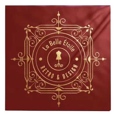
- A gold or metallic foil design pairs well with rich tones like burgundy or emerald green.
- Avoid subtle color pairings, such as pastel yellow on white, as they can diminish legibility.
- Fabric Impact: Remember that fabric texture can affect color perception. For instance, matte-finished cotton may make colors appear slightly subdued compared to glossy polyester.
Typography and Text Size
Readable and well-proportioned text is essential for ensuring clarity in your design:
- Minimum Font Size: For printed napkins, use a minimum font size of 12 points for small text to ensure legibility. For embroidery, larger fonts (around 14-16 points) are often necessary due to the thread's thickness and the stitching process.
- Font Selection: Choose clear, simple fonts for better readability. Avoid overly intricate, fine, or script fonts, especially for embroidery, as they may lose detail or appear messy. Fonts with clean, bold lines, like Arial or Helvetica, work well for both printing and embroidery.
- Text Placement: Keep text aligned with key focal points, such as the napkin center or corners. Ensure the spacing between lines and letters (kerning) is consistent for a polished appearance.
Step-by-Step
Step 1: Choose Your Napkin Type
Step 2: Select Your Printing Technique
Consider the following options based on your design and event needs:
- How it works: Digital printing transfers designs directly onto the fabric.
- Benefits: Vibrant, full-color designs with detailed accuracy. Suitable for complex patterns, gradients, or multi-color logos.
- Care: Ensure the ink is heat-set for durability through multiple washes.
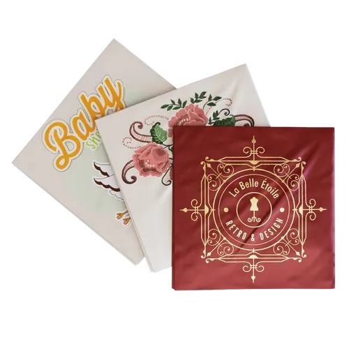
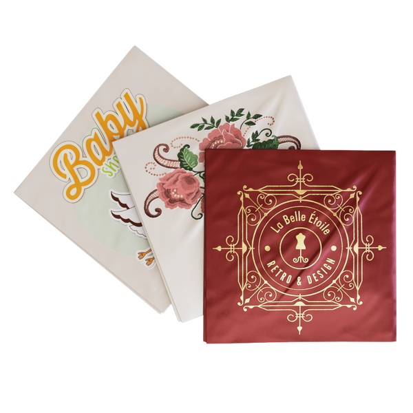
- Foil-Stamped Cloth Napkins:
- How it works: A heated die applies metallic foil under pressure, creating a reflective, embossed finish.
- Benefits: Adds a luxurious and elegant touch, perfect for weddings or black-tie events.
- Care: Hand wash is recommended to preserve the foil's luster.
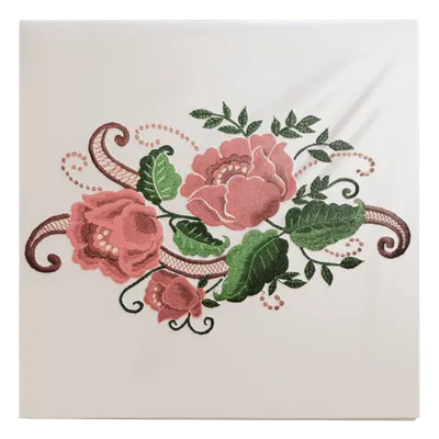
- Embroidered Cloth Napkins:
- How it works: Thread stitching creates the design directly on the fabric.
- Benefits: Provides texture, depth, and a premium aesthetic. Ideal for monograms or minimalist logos.
- Care: Machine washable, but gentle cycles are recommended to maintain thread integrity.
Step 3: Choose the Napkin Color
Your napkin’s base color sets the tone for the table decor. Here’s how to choose wisely:
- Match napkins with tableware and tablecloths for a cohesive look.
- Opt for neutral tones (white, beige, or gray) for versatility or bold colors to make a statement.
- Light pastels for spring events.
- Warm tones like deep red or gold for autumn and winter gatherings.
- If your napkins include patterned designs, keep the base color subtle to highlight the details.
Step 4: Decide on Print Orientation
The placement and angle of your design can significantly impact the napkin’s visual appeal:
- Classic Square Orientation: Aligns the design parallel to the napkin edges. Ideal for symmetry, logos, and formal aesthetics.
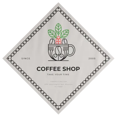
- Diagonal Orientation: Creates a dynamic and modern vibe. Great for casual events or creative themes where the design emphasizes movement.
Step 5: Customize Your Napkin
Make your napkins truly one-of-a-kind by selecting the best customization approach:
- Upload Your Artwork: Use high-quality files (AI, EPS, PDF, or 300 DPI PNG/JPEG) to ensure clarity. Verify the design fits within the printable area without distortion.
- Add Text or Monograms: Use this option for names, event dates, or simple logos. Experiment with font styles and colors to align with your theme.
- Design from Scratch: Utilize an online design platform to create unique patterns or illustrations. Preview the layout to ensure the design is aligned and scaled appropriately.
Step 6: Select Your Delivery Timeline
Timely delivery ensures your napkins are ready for the big day. Contact customer service for exact delivery timelines and order tracking updates.












/filters:quality(80)/fit-in/500x500/20250111-e1ccbb80-d097-11ef-9f2a-892789ed137d.jpeg)
/filters:quality(80)/fit-in/500x500/20250105-62dcf2c0-cbd8-11ef-80c7-cf0be861d583.jpeg)
/filters:quality(80)/fit-in/500x500/20241216-7cb66990-bbc3-11ef-ab59-25c68c576e86.jpg)
/filters:quality(80)/fit-in/500x500/20241211-62f97ce0-b7e0-11ef-aa2a-2b6503a888f3.jpg)
/filters:quality(80)/fit-in/500x500/20241211-656d6160-b7dc-11ef-8a23-f94d292bf45a.jpeg)
/filters:quality(80)/fit-in/500x500/20241030-c0ffec70-96c4-11ef-9d59-b94ccfbb9ac8.jpeg)
/filters:quality(80)/fit-in/500x500/20240925-a4325560-7b60-11ef-b321-5d32bcb964ba.png)
/filters:quality(80)/fit-in/500x500/20240919-dc291cc0-76e1-11ef-a76f-53fd5de2536c.jpg)
/filters:quality(80)/fit-in/500x500/20240913-c7bd9fa0-721f-11ef-b28a-070228e2f51e.png)
/filters:quality(80)/fit-in/500x500/20240829-e660c880-6673-11ef-a320-1d83de28edb7.png)
/filters:quality(80)/fit-in/500x500/20240729-a5470d50-4da3-11ef-829a-2964fd1472b7.jpg)
/filters:quality(80)/fit-in/500x500/20240724-0c838810-49b7-11ef-bf2a-5755b6f23dd7.png)
/filters:quality(80)/fit-in/500x500/20240719-80ec5440-45be-11ef-8a69-7fa5527f38a6.jpeg)
/filters:quality(80)/fit-in/500x500/20240708-090308d0-3d84-11ef-9aea-e122388fc8b5.jpeg)
/filters:quality(80)/fit-in/500x500/20240620-0d9e8380-2f07-11ef-a9fe-6d609c33d7c7.jpeg)